You might say that there is some significance to my interest in doors and photographing them when I travel. Doors are both for entry and exit. Doors are associated with passage. In other words, doors lead to someplace other than where you are.
To me, a door is a symbol of opportunity (as in opportunity knocks…on the door!). Doors and doorways are symbols of transition.
Seeing unusual doors when I travel is mysterious. My imagination runs freely. “Behind closed doors”- what lies beyond it? Are these doors protecting something? When a door is open it could mean I’m invited to move forward into a new adventure.
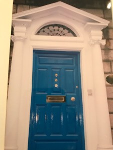
The colors of doors can also be telling you something about the people behind the door. A beautiful example of color for doors is Merrion Square in Dublin. Here you see the well photographed Doors of Dublin on the beautiful Georgian townhouses. The custom of colorful doors goes back to when the Square was first built. There were strict rules to adhere to architectural guidelines. The only way to express individuality and set your home apart from the rest was to select a bright color for your door.
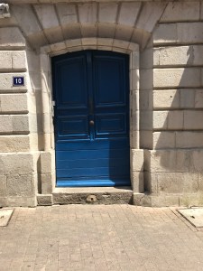
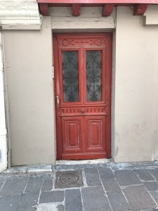
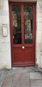
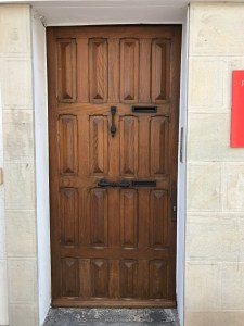
I read in a door color ideas blog by The Pro Team about what colors say about you. Colors represent different messages. Red is “welcome”. Orange says you are very social. Blue says you enjoy peace and truth. Gray is an indecisive color and says you prefer compromise. Green says you have traditional values. Black says your world is ordered and controlled. White says simple and organized. Brown says you are warm, reliable and stable. Yellow says you are positive and logical while also creative. Turquoise speaks to emotional balance, a romantic dreamer. Pink is for a hopeless romantic. Purple says you are comfortable taking risks. Wood says you are generous and down to earth .
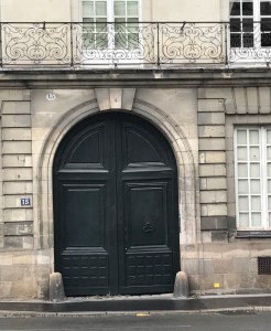
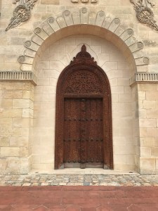
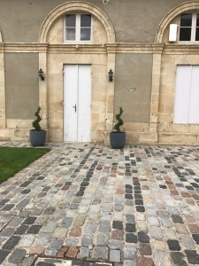
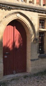
Here are some of the doors I saw this summer on our trip to Europe.
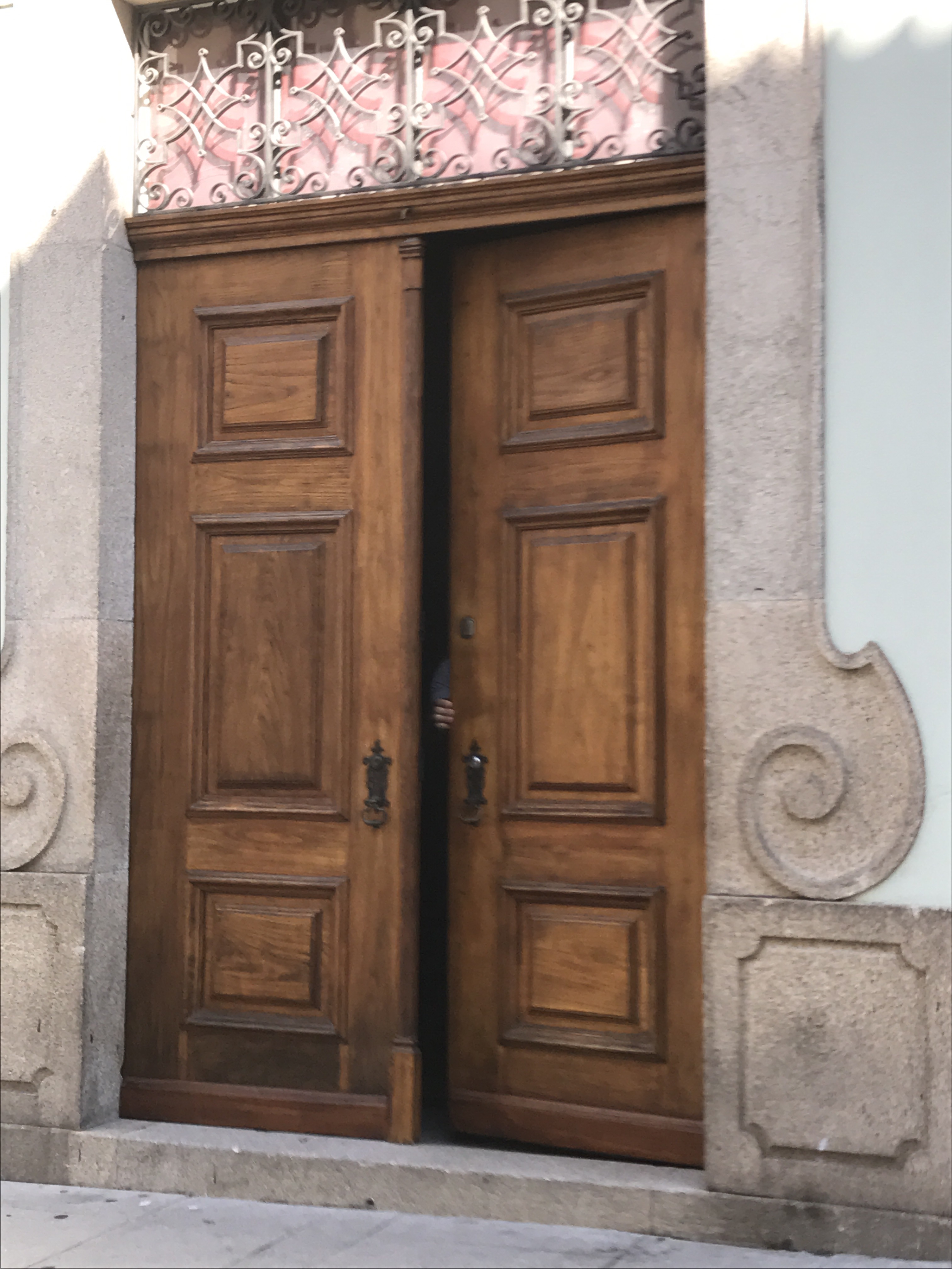
Porto Portugal

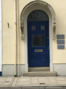
Beaumaris, Wales
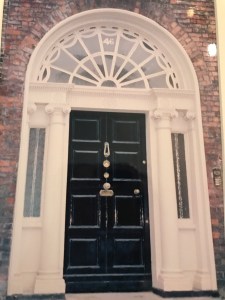
Merrion Square, Dublin


Nantes, France


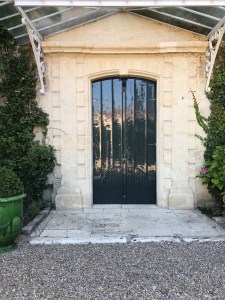
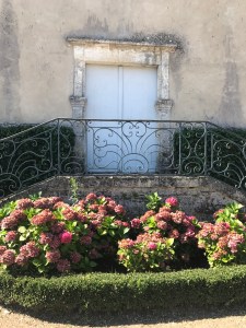
Saint-Estephe, France
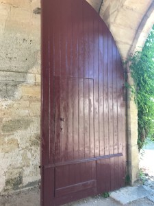
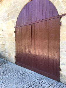
Saint-Emilion, France

Liborne, France
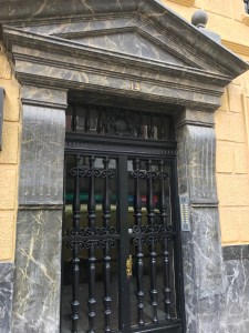
San Sebastian, Spain (Basque)


Saint-Jean-de-Luz, France (Basque)

Bilboa Spain

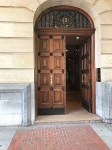
I leave you with an open door.

You must be logged in to post a comment.