TOP IT OFF- Spring Part 2- Tops, Dresses And Skirts

The most exciting thing for Spring this year are all the shapes and varieties of  style in every category of apparel. I think that the biggest trend is in tops, specifically sleeves.

SLEEVES. The cold shoulder came on like crazy in 2016. Actually, the cold shoulder goes back to 1992 when Donna Karan released her “cold shoulder” dress which was a long sleeved jersey dress with the cut out shoulder. It has been in and out of the spotlight over the years, but in 2016 it started coming on strong again. This year it is on fire as is a lot of sleeve treatments. And why wouldn’t it be a best seller? Just about everyone has a good shoulder to show off. You can get cold shoulder tops and dresses in a wide variety of fabrications. There are bell sleeves, ruffled sleeves, ruffled bell sleeves, ruffled shoulders, peak-a-boo 3/4 sleeves (this encompasses slit sleeves as well as a variety of cut outs). It really adds a lot of fun and style to how you put yourself together.

HEMLINES. We can continue to enjoy asymmetric hems this season. Shark bite hems are seen on lots of tops, dresses and skirts. I think that the most popular is the high-low hemline. This gives you a great look coming and going into a room. There is interest added into the asymmetry on skirts by adding a cascading ruffle down the side, or high slits.

In dresses, the big statement is a floral print. There are soft pastel prints which cover the pinks, lavenders, mints and peach. The pastels are a beautiful story if you are happy being in pastels. In this category you will also see gingham checks in pinks and blues as well as navy. Then there are the Bohemian darker floral prints which bring you to a more free spirited, sensual period of dressing. There are many beautiful spice colors that fit in this category (think Morocco, think breeze-catching dresses).

Dots and Stripes.  Lots and lots of both patterns this season. In some cases the dots, stripes and florals are combined into patchwork  prints. Stripes are never out. Most visible are color and white, or color and black. Somehow stripes always look fresh.

Another look for the season is the lingerie inspired kimono. Soft fabrications of chiffon and crepe de chine in beautiful prints are a very good look over solid dresses (great if you are not crazy about showing upper arms) as well as a “jacket” over a tank or tee with pants or a skirt. Take one of these kimonos, belted or unbelted, and pair it with a high slit palazzo pant or an asymmetric skirt and you could be going out to a wedding or an important dinner.

If I had to recommend one update to your wardrobe this spring I would say that the Trifecta would be a cold shoulder top, with a bell sleeve and a high-low hem.

As I always say,  enjoy getting dressed!!

Saying Goodbye To Mom

Mom passed away on March 17th after a well lived life of 93 years, 7 months. The following is my “Reflection” that was read my my cousin Tom at the funeral last week. I thank Tom for reading this because I never would have been able to do it that day. It will be a huge transition for me to no longer have Mom here. I would like to think that we both will transition in style.

Mom…she had a lightness in her spirit. Her light shone from within. She was always positive, she was always supportive. She was fun to be with and was always excited to see us. Even as the dementia progressed, she never “lost” us. She always knew us and was thrilled to see us. She loved our daily cups of tea or coffee together. When we took our afternoon walks with her she would stop to say hi to everyone we passed. She was always complimenting someone on how they looked and asking how they were. Everyone would tell her how lucky she was to have her family with her. To her, we were the light in her life. For us, it was always her.

She championed all of our causes and never let us down. For her, the family was everything. Dad was the love of her life but he had to share her love with us which was not a problem because she had plenty to give.  Her parents, her sister Kay and her brothers Tom and Donald also meant the world to her.  Mom came from very poor beginnings but her love for family and her faith in God made her rich. That richness and her positive attitude, always a positive attitude, permeated her life and led her to the wonderful life with Dad that she so deserved. There was no love missing in our house. You could always feel it surround you and support you. She was generous, kind and loving.

If we are half the person that Mom was, we can consider our lives a success.

I am certain that on St Patrick’s day she and Aunt Kay were step dancing once again, and that Dad was watching and when they finished their dance he requested a cha-cha for them.

I saw a poem by Irene Conner that was perfect for us now.

Although you cannot hear her voice                                                                                                 Or see her smile no more,                                                                                                                   Your mother walks beside you still                                                                                                   Just as she did before.                                                                                                                           She listens to your stories and                                                                                                           She wipes away your tears,                                                                                                                 She wraps her arms around you                                                                                                         And she understands your fears.                                                                                                       It’s just she isn’t visible                                                                                                                         To see with human eye,                                                                                                                         But talk to her in silence and                                                                                                               Her spirit will reply.                                                                                                                             You’ll feel the love she has for you                                                                                                     You’ll hear her in your heart,                                                                                                             She’s left her human body,                                                                                                                   But your souls will never part.

Mom will be missed.


SPRING ’18 PART 1- PANTS

A new season is upon us. Let’s look at pants for spring-summer ’18, but first, here is a short tutorial on this category.  In the spring and summer the selection for pants is vast. Here are the lengths that one encounters for the warmer weather seasons.

Working from the ground up we’ll start with a full length pant. Inseam is between 28″ to 31″ depending on if the length is considered  petite, regular or tall. Next is an Ankle length which is self explanatory.  This length has become popular over the last couple of years.  Next is the Crop Pant which has a 23″ inseam. Crop pants are followed by Capri Pants with a 20″ inseam. Sharing in this length are pants that were popular in the 50’s and 60’s- Pedal Pushers AKA Clam Diggers. The difference here is that the Capri widens through the thigh to the leg opening and the pedal pusher fits close to the leg. Next is the Gaucho which has a 21″ inseam and is wide through the thigh and has a more generous cut. Culottes have an 18″ inseam and have a semi fitted wide leg. This is followed by shorts: Bermuda (13″ inseam), Walking Short (slightly shorter than Bermudas),  City Short (11″ inseam and a more tailored cut), Skort which is a skirt over a short, usually knee length for the skirted portion, and if you can carry it off, short shorts (these days usually in the form of cut off, cut up denim).

I think we can say that there is a length for every occasion and every body type!

This year there is a great selection of wide leg pants. The Palazzo pant was originally a trouser cut with the wide leg flaring from the knee. They were worn by trend setters in the 20’s such as Coco Chanel, then  Katherine Hepburn in the 30’s. Then in the 60’s they took off again. In the 80’s the Palazzo was part of the power suit. Variations on the wide leg pant are also “bell bottoms” and “flared leg”. This year you will see a cross section of fabrics for the Palazzo pants.  There are also long cropped gauchos. There are jogger pants elasticized at the hem. There are cargo pocket pants. A few great looking styles I have seen have either a side slit, a front slit, or a back slit. The slits are at varying heights on the wide leg pants.

There are lots of printed pants out this season too. There are all over prints as well as placement prints or embroidery.

Going to be a great season for pants. Shoe accessorizing is a topic for another day.

CAN SPRING BE FAR BEHIND?

What better time than watching the snow fall to think about Spring 2018 colors?

The team at the Pantone Color Institute create the trend report highlighting the top colors shown by designers showing at the NY Fashion Week which took place in September. These colors will be featured in their collections and the colors seen at the show tell us what we can expect to see in all areas of design.

Colors for Spring are so POWERFUL! Laurie Pressman (Pantone)  says “The desire for colorful self expression is a key take away for Spring 2018. The color story is wildly divergent and we see a kaleidoscopic bounty of uplifting shades and feel-good tones.” The colors encourage experimenting with mixing the colors in all sorts of ways. Mixing of these colors can be fun or very dramatic.

img_1873-1img_1874img_1875img_1877img_1878img_1879img_1880img_1881img_1882img_1883img_1884img_1885

There is also a classic color palette, These four colors are the anchors for everyone. Sailor Blue, Coconut Milk, Warm Sand, Harbor Mist (dove gray)

img_1887img_1890img_1889img_1888

Ultra Violet has been named the color of the year for 2018. This color, and shades of, will be seen in the stores as the year progresses. Actual spring for most manufacturers had already been planned by this point. I think Cherry Tomato will be big for Spring. There will be lots of bright colors to enjoy this season.

Enjoy and have fun with it.

Hello 20-Great Teen!

Another year is about to start. I think that for this year I am wishing for a positive attitude to permeate all of the people I know and the zillions of people I don’t know!

20-Great-Teen! I love this! My 29 year old friend Carl shared this with me and I told him that I was stealing it because I think that if everyone had this as their mantra it would indeed be a great 2018.

Since it is a time for resolutions it is best to keep them simple and attainable. Here is a question for you. When was the last time you tried something for the first time? Think about it and come up with a list of things to try. It could be as simple as trying something new on a menu or learning about something that has always been interesting to you.

This year I am going to update my Bucket List and really work at chipping away at it! For me that means exploring places I have not yet been to or, in some cases, returning to places I have been to and explore them more thoroughly. Also high on my bucket list is spending quality time with family and friends and really get to know what makes them tick. I intend to spend time with elders at my Mom’s residence as well as spend time with my soon to be 4 grandson and the new baby that will come on the scene in May. There is so much to be learned from those on each end of the age spectrum.

I wish all of you a wonderful new year filled with happiness and perhaps some new beginnings. Try something new…you might find it incredibly worthwhile.

Happy 20-GREAT-TEEN.

Old World vs Modern

This summer when we were traveling in Europe I chose two distinctively different hotels for our extra days on each end of the cruise.

The first was in Lisbon Portugal. We fell in love with the pictures of Avenida Palace on the internet. It was so old world and looked like such a romantic spot to start our vacation. As exhausted as we were when we arrived I could not help wanting to look all around as soon as we got there.

The lobby at the entrance was glorious with a magnificent bouquet in the center of the room. The second photo was where you could have a cocktail in the afternoon while a piano or violins were playing. Our room turned out to be a living room, bedroom and bath. Outside of our room was a very glamorous staircase that spiraled up to the top. There was a sitting/reading area outside of our door too! In our room there was a writing desk in its own alcove. The second floor had large open seating areas perfect for meeting friends. There was a lovely dining room where breakfast was served and was included with the cost of our room. Far and away my favorite room was the bar. It was gorgeous and there was a friendly chatty bartender.  There was a very helpful concierge who helped to get us reservations for a restaurant with a Fado show (this is a must when visiting Portugal) and got a guide for us for a morning tour.  Without having to give it too much thought, I decided we could live happily ever after in this lovely hotel.

At the end of our trip we extended for a couple of days in Bilboa Spain. Bilboa is the home of The Guggenheim museum and the reason I wanted to explore this city. In looking for a hotel my mind switched to modern and a location that we could walk to the museum. I found Hotel Miro right down the street from the Guggenheim.

The hotel was very sleek and modern. There was total use of space, and you did not get much space in your room.  At first I though there was no closet but then I found it behind a curtain that served as a room divider between the sleeping area and the sink/shower area. The toilet was separate and had a door off of the sink/shower area. You better not be too shy about sharing space!  Breakfast was not included.  There was a small bar that was geared to coffee and non-alcohol drinks, but you could have wine. Local restaurants and bars in the area were good. We had terrific pintxos and drinks in the afternoon and really good Spanish wines with dinner.

So, which would you chose? The Avenida Palace was about $100 more a night, but it did include breakfast for two. Cost aside, which would you go for? I like to mix things up when we travel so it was fun for us to experience both ends of the  spectrum.

The Color for 2018 Is…

For months there has been a buzz about Purple having “a moment” in 2018. Well, the Pantone Color Institute has made that official with the selection of Ultra Violet (18-3838) as the color of the year for 2018.

What is the difference between Purple and Ultra Violet? Purple is a mix between equal parts of blue and red. Violet has its own measurement on the visual spectrum of light. The basic difference is that Purple is closer to red and Violet is closer to blue.

According to Pantone, Ultra Violet is “a dramatically provocative and thoughtful purple shade…communicates originality, ingenuity and visionary thinking that points toward the future.”  This color represents royalty, magic and mystery.  Prince wrote about Purple Rain, Jimi Hendrix about a Purple Haze and David Bowe seemed to love all things purple. Purple represents individuality and creativity.

As Jenny Joseph says in her poem titled Warning,   “When I am an old woman, I shall wear purple.” Why wait? 2018 surely will bring on lots of beautiful clothing in Ultra Violet and other shades of purple. I am a firm believer in the psychology of color. Go for it! We can all feel royal and creative.

FALL AND HOLIDAY 2017

For me, the only drawback to the change of season is that I have to put my sandals away until spring.

Fall…I love the clean, crisp air and getting my closet transitioned for the season.  Time to reevaluate what I have and what I need (well, really the word is want) to add for this season.

For most of the women I know there are a few really good trends for fall and holiday that will update your look. One key look for this season is lace. You will see lace dresses, shirts, jackets, tops and tees. It is trimming everything-jeans as well as the hems on many styles of knit tops.  Open work detail is also popular this season in burnout velvet for tops and dusters. You will also see lots of velvet in pants, tops and jackets. The look is very boho and is very attractive. There is also a strong presence of embroidery. Embroidery is on jeans, tops, sweaters, jackets.  The motif is primarily floral which ties in to another big look for the season. Something in a floral print is a must-have. Having been intimately involved in selecting and editing prints throughout my career, I can tell you that the floral prints being shown this season are really beautiful and very wearable. Bold and cold shoulders continue. Good thing because that was an addition I made in 2016!  Along side of shoulders being exposed are cozy tunic sweaters. The look is best with midi length skirts. Sweaters are not just pull-overs, look for drape front cardigans (which have been trending for several seasons) and fit-and-flare styles.  Sleeves are center stage. Bell sleeves (both modified and exaggerated) are the biggest design feature for the season. There are also lots of ruffled and pleated sleeves for you to select. Leather is another factor for this season. If you really want to make a statement, go for a double look- top and pant or top and skirt. A finishing touch would be a silk scarf to soften the look. And, a more affordable approach is faux leather which has been gaining in popularity and acceptance for many years.

Boots deserve a separate paragraph. If you really want to “kick” up your look buy a pair of boots! Ankle boots continue to dominate the category but this year there are many styles available in over-the-knee and a ’70’s slouchy look. Heel heights vary quite a bit so there really is something for everyone. There are even boots that sparkle and there are winter white boots (As I write this I am hearing Nancy Sinatra singing “these boots are made for walkin’ “).  The love of embroidery and prints this season reaches all the way down to your toes. There are some beautiful printed and embroidered styles out there. These fall into the pricier category though, and obviously won’t be worn with everything.

In articles I’ve read they talk about a “statement piece” in high shine and cited that a trench coat translates this best. This brought back so many memories for me! My Dad was in the fashion business and when I was starting college he saw a red vinyl maxi trench coat and brought it home for me! I was so excited I could not wait to wear it! Needless to say you could spot me across campus. Wish I had  kept it. Gee, we always get rid of the wrong stuff.

To sum up, for a quick style up date consider lace, velvet, embroidery, floral print, and a new pair of boots!

Portals of Europe 2017

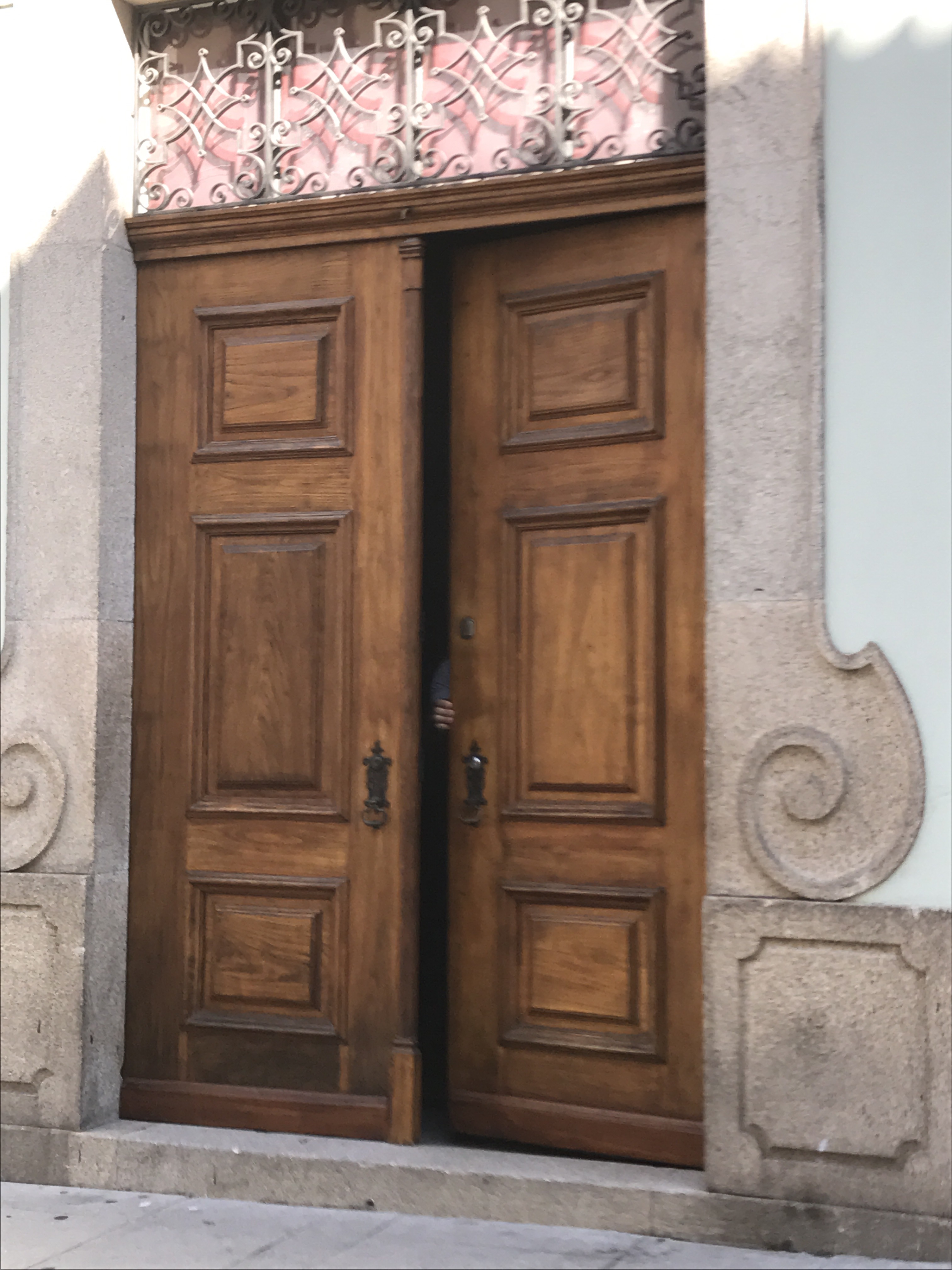
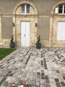
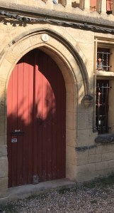
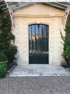
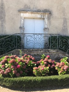
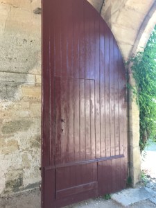
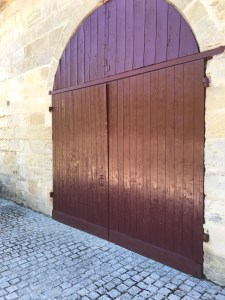
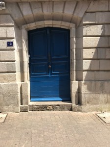
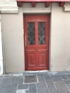
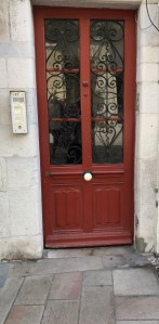
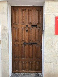
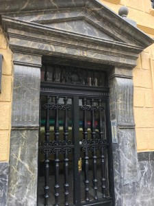
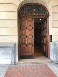
You might say that there is some significance to my interest in doors and photographing them when I travel.  Doors are both for entry and exit. Doors are associated with passage. In other words, doors lead to someplace other than where you are.

To me, a door is a symbol of opportunity (as in opportunity knocks…on the door!).  Doors and doorways are symbols of transition.

Seeing unusual doors when I travel is mysterious. My imagination runs freely. “Behind closed doors”- what lies beyond it? Are these doors protecting something? When a door is open it could mean I’m invited to move forward into a  new adventure.

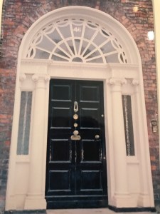
The colors of doors can also be telling you something about the people behind the door. A beautiful example of color for doors is Merrion Square in Dublin. Here you see the well photographed Doors of Dublin on the beautiful Georgian townhouses. The custom of colorful doors goes back to when the Square was first built. There were strict rules to adhere to architectural guidelines. The only way to express individuality and set your home apart from the rest was to select a bright color for your door.

I read in a door color ideas blog by The Pro Team about what colors say about you. Colors represent different messages. Red is “welcome”. Orange says you are very social. Blue says you enjoy peace and truth. Gray is an indecisive color and says you prefer compromise.  Green says you have traditional values. Black says your world is ordered and controlled. White says simple and organized. Brown says you are warm, reliable and stable. Yellow says you are positive and logical while also creative. Turquoise speaks to emotional balance, a romantic dreamer. Pink is for a hopeless romantic. Purple says you are comfortable taking risks. Wood says you are generous and down to earth .
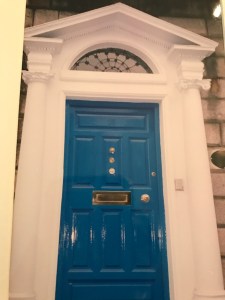
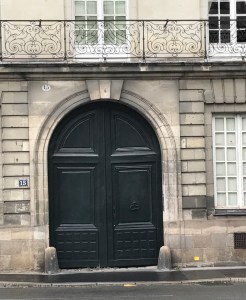
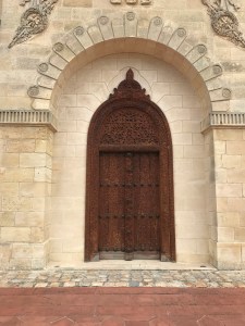
Here are some of the doors I saw this summer on our trip to Europe.

Porto Portugal

img_0523-1

Beaumaris, Wales

Merrion Square, Dublin

img_1178
img_1177
img_1179
img_1176

Nantes, France

img_0729
img_0734
img_0724

Saint-Estephe, France

img_0765
img_0771
img_0848-1

Saint-Emilion, France

img_0851
img_0873

Liborne, France

img_0877
img_0875
img_0891

San Sebastian, Spain (Basque)

img_0955
img_0967-2

Saint-Jean-de-Luz, France (Basque)

img_0971-1
img_0972
img_0973-2
img_0974-2
img_0975-2

Bilboa Spain

img_0999-1
img_0993-2
img_1072

I leave you with an open door.

Fall 2017…SEEING RED

Here we are at September 1, 2017. Definitely time to start thinking about Fall colors.
For Fall here are the Pantone colors:

17-1558 Grenadine-It is a powerful red. It is a warm red that to my eye has a coral-orange base rather than a Christmas red. Very attractive color that will be great on a variety of skin tones.  Think about the color of the syrup used for some cocktails like a Singapore Sling or a Pink Lady.

19-1725 Tawny Port- sticking with the alcohol references, think about a glass of Port wine.  This is a rich and sophisticated color in the deep red family.

13-2808 Ballet Slipper– this is a very soft pink “descended from the red family” but so soft. This was our go-to pink when I was buying or merchandising lingerie and sleepwear. It is very flattering and gives the wearer a rosy glow.

16-1341 Butterum– a warm tan shade. Think of a perfectly toasted slice of bread, or , if you want to stay with the alcohol references, think of a glass of Butterum!

19-4029 Navy Peony– This shade of navy is a perfect anchoring color. Some say it takes some of the load off of black as everyone’s go-to color. Navy is actually more flattering to most complexions than black is. But, seriously, would anyone ever surrender black in their wardrobe?

17-4402 Neutral Gray– Pantone refers to this as “the standard bearer of all neutrals.” This color also anchors the palette and can either be an accent or a total monochromatic outfit.

19-4524 Shaded Spruce- This is a beautiful deep shade of green with a lot of blue in it. Think of the Blue Spruce trees that some people choose for their Christmas tree.

16-0543 Golden Lime– Very earthy shade with golden undertones. This is a nice complement to the fall palette.

17-4041 Marina- This is a beautiful shade of blue. It is the only cool color in the palette and it is fresh and bright.

17-1145 Autumn Maple– THE autumnal color. This is a warm color and is a combination of rusts. Think falling leaves.

A new color has been created by Pantone and the Prince Estate. It will be called “Love Symbol #2″. It is a distinctive blue base purple developed to honor Prince. This will insure that there will be consistency with the color and will safeguard his legacy forever.