Hello 20-Great Teen!

Another year is about to start. I think that for this year I am wishing for a positive attitude to permeate all of the people I know and the zillions of people I don’t know!

20-Great-Teen! I love this! My 29 year old friend Carl shared this with me and I told him that I was stealing it because I think that if everyone had this as their mantra it would indeed be a great 2018.

Since it is a time for resolutions it is best to keep them simple and attainable. Here is a question for you. When was the last time you tried something for the first time? Think about it and come up with a list of things to try. It could be as simple as trying something new on a menu or learning about something that has always been interesting to you.

This year I am going to update my Bucket List and really work at chipping away at it! For me that means exploring places I have not yet been to or, in some cases, returning to places I have been to and explore them more thoroughly. Also high on my bucket list is spending quality time with family and friends and really get to know what makes them tick. I intend to spend time with elders at my Mom’s residence as well as spend time with my soon to be 4 grandson and the new baby that will come on the scene in May. There is so much to be learned from those on each end of the age spectrum.

I wish all of you a wonderful new year filled with happiness and perhaps some new beginnings. Try something new…you might find it incredibly worthwhile.

Happy 20-GREAT-TEEN.

Old World vs Modern

This summer when we were traveling in Europe I chose two distinctively different hotels for our extra days on each end of the cruise.
The first was in Lisbon Portugal. We fell in love with the pictures of Avenida Palace on the internet. It was so old world and looked like such a romantic spot to start our vacation. As exhausted as we were when we arrived I could not help wanting to look all around as soon as we got there.

The lobby at the entrance was glorious with a magnificent bouquet in the center of the room. The second photo was where you could have a cocktail in the afternoon while a piano or violins were playing. Our room turned out to be a living room, bedroom and bath. Outside of our room was a very glamorous staircase that spiraled up to the top. There was a sitting/reading area outside of our door too! In our room there was a writing desk in its own alcove. The second floor had large open seating areas perfect for meeting friends. There was a lovely dining room where breakfast was served and was included with the cost of our room. Far and away my favorite room was the bar. It was gorgeous and there was a friendly chatty bartender.  There was a very helpful concierge who helped to get us reservations for a restaurant with a Fado show (this is a must when visiting Portugal) and got a guide for us for a morning tour.  Without having to give it too much thought, I decided we could live happily ever after in this lovely hotel.

At the end of our trip we extended for a couple of days in Bilboa Spain. Bilboa is the home of The Guggenheim museum and the reason I wanted to explore this city. In looking for a hotel my mind switched to modern and a location that we could walk to the museum. I found Hotel Miro right down the street from the Guggenheim.

The hotel was very sleek and modern. There was total use of space, and you did not get much space in your room.  At first I though there was no closet but then I found it behind a curtain that served as a room divider between the sleeping area and the sink/shower area. The toilet was separate and had a door off of the sink/shower area. You better not be too shy about sharing space!  Breakfast was not included.  There was a small bar that was geared to coffee and non-alcohol drinks, but you could have wine. Local restaurants and bars in the area were good. We had terrific pintxos and drinks in the afternoon and really good Spanish wines with dinner.

So, which would you chose? The Avenida Palace was about $100 more a night, but it did include breakfast for two. Cost aside, which would you go for? I like to mix things up when we travel so it was fun for us to experience both ends of the  spectrum.

The Color for 2018 Is…

For months there has been a buzz about Purple having “a moment” in 2018. Well, the Pantone Color Institute has made that official with the selection of Ultra Violet (18-3838) as the color of the year for 2018.

What is the difference between Purple and Ultra Violet? Purple is a mix between equal parts of blue and red. Violet has its own measurement on the visual spectrum of light. The basic difference is that Purple is closer to red and Violet is closer to blue.

According to Pantone, Ultra Violet is “a dramatically provocative and thoughtful purple shade…communicates originality, ingenuity and visionary thinking that points toward the future.”  This color represents royalty, magic and mystery.  Prince wrote about Purple Rain, Jimi Hendrix about a Purple Haze and David Bowe seemed to love all things purple. Purple represents individuality and creativity.

As Jenny Joseph says in her poem titled Warning,   “When I am an old woman, I shall wear purple.” Why wait? 2018 surely will bring on lots of beautiful clothing in Ultra Violet and other shades of purple. I am a firm believer in the psychology of color. Go for it! We can all feel royal and creative.

FALL AND HOLIDAY 2017

For me, the only drawback to the change of season is that I have to put my sandals away until spring.

Fall…I love the clean, crisp air and getting my closet transitioned for the season.  Time to reevaluate what I have and what I need (well, really the word is want) to add for this season.

For most of the women I know there are a few really good trends for fall and holiday that will update your look. One key look for this season is lace. You will see lace dresses, shirts, jackets, tops and tees. It is trimming everything-jeans as well as the hems on many styles of knit tops.  Open work detail is also popular this season in burnout velvet for tops and dusters. You will also see lots of velvet in pants, tops and jackets. The look is very boho and is very attractive. There is also a strong presence of embroidery. Embroidery is on jeans, tops, sweaters, jackets.  The motif is primarily floral which ties in to another big look for the season. Something in a floral print is a must-have. Having been intimately involved in selecting and editing prints throughout my career, I can tell you that the floral prints being shown this season are really beautiful and very wearable. Bold and cold shoulders continue. Good thing because that was an addition I made in 2016!  Along side of shoulders being exposed are cozy tunic sweaters. The look is best with midi length skirts. Sweaters are not just pull-overs, look for drape front cardigans (which have been trending for several seasons) and fit-and-flare styles.  Sleeves are center stage. Bell sleeves (both modified and exaggerated) are the biggest design feature for the season. There are also lots of ruffled and pleated sleeves for you to select. Leather is another factor for this season. If you really want to make a statement, go for a double look- top and pant or top and skirt. A finishing touch would be a silk scarf to soften the look. And, a more affordable approach is faux leather which has been gaining in popularity and acceptance for many years.

Boots deserve a separate paragraph. If you really want to “kick” up your look buy a pair of boots! Ankle boots continue to dominate the category but this year there are many styles available in over-the-knee and a ’70’s slouchy look. Heel heights vary quite a bit so there really is something for everyone. There are even boots that sparkle and there are winter white boots (As I write this I am hearing Nancy Sinatra singing “these boots are made for walkin’ “).  The love of embroidery and prints this season reaches all the way down to your toes. There are some beautiful printed and embroidered styles out there. These fall into the pricier category though, and obviously won’t be worn with everything.

In articles I’ve read they talk about a “statement piece” in high shine and cited that a trench coat translates this best. This brought back so many memories for me! My Dad was in the fashion business and when I was starting college he saw a red vinyl maxi trench coat and brought it home for me! I was so excited I could not wait to wear it! Needless to say you could spot me across campus. Wish I had  kept it. Gee, we always get rid of the wrong stuff.

To sum up, for a quick style up date consider lace, velvet, embroidery, floral print, and a new pair of boots!

Portals of Europe 2017

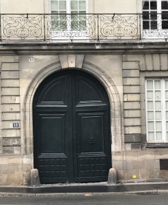
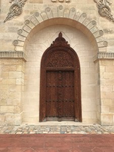
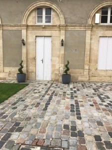
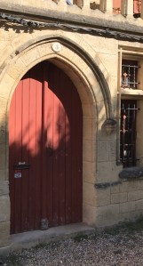
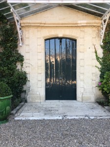
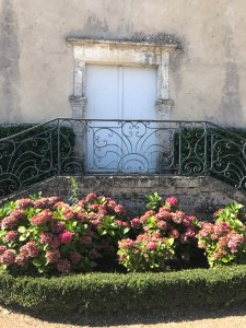
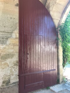
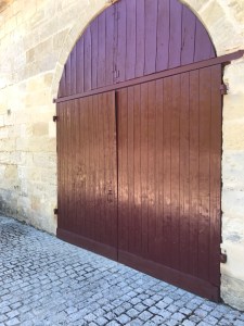
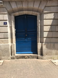
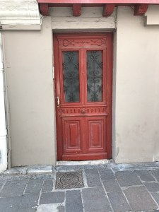
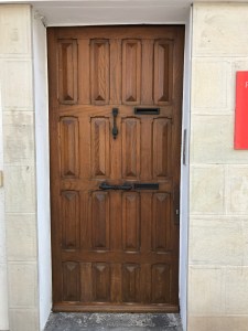
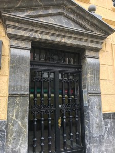
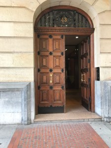
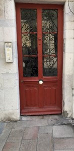
You might say that there is some significance to my interest in doors and photographing them when I travel.  Doors are both for entry and exit. Doors are associated with passage. In other words, doors lead to someplace other than where you are.

To me, a door is a symbol of opportunity (as in opportunity knocks…on the door!).  Doors and doorways are symbols of transition.

Seeing unusual doors when I travel is mysterious. My imagination runs freely. “Behind closed doors”- what lies beyond it? Are these doors protecting something? When a door is open it could mean I’m invited to move forward into a  new adventure.

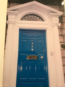
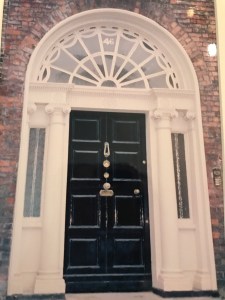
The colors of doors can also be telling you something about the people behind the door. A beautiful example of color for doors is Merrion Square in Dublin. Here you see the well photographed Doors of Dublin on the beautiful Georgian townhouses. The custom of colorful doors goes back to when the Square was first built. There were strict rules to adhere to architectural guidelines. The only way to express individuality and set your home apart from the rest was to select a bright color for your door.

I read in a door color ideas blog by The Pro Team about what colors say about you. Colors represent different messages. Red is “welcome”. Orange says you are very social. Blue says you enjoy peace and truth. Gray is an indecisive color and says you prefer compromise.  Green says you have traditional values. Black says your world is ordered and controlled. White says simple and organized. Brown says you are warm, reliable and stable. Yellow says you are positive and logical while also creative. Turquoise speaks to emotional balance, a romantic dreamer. Pink is for a hopeless romantic. Purple says you are comfortable taking risks. Wood says you are generous and down to earth .

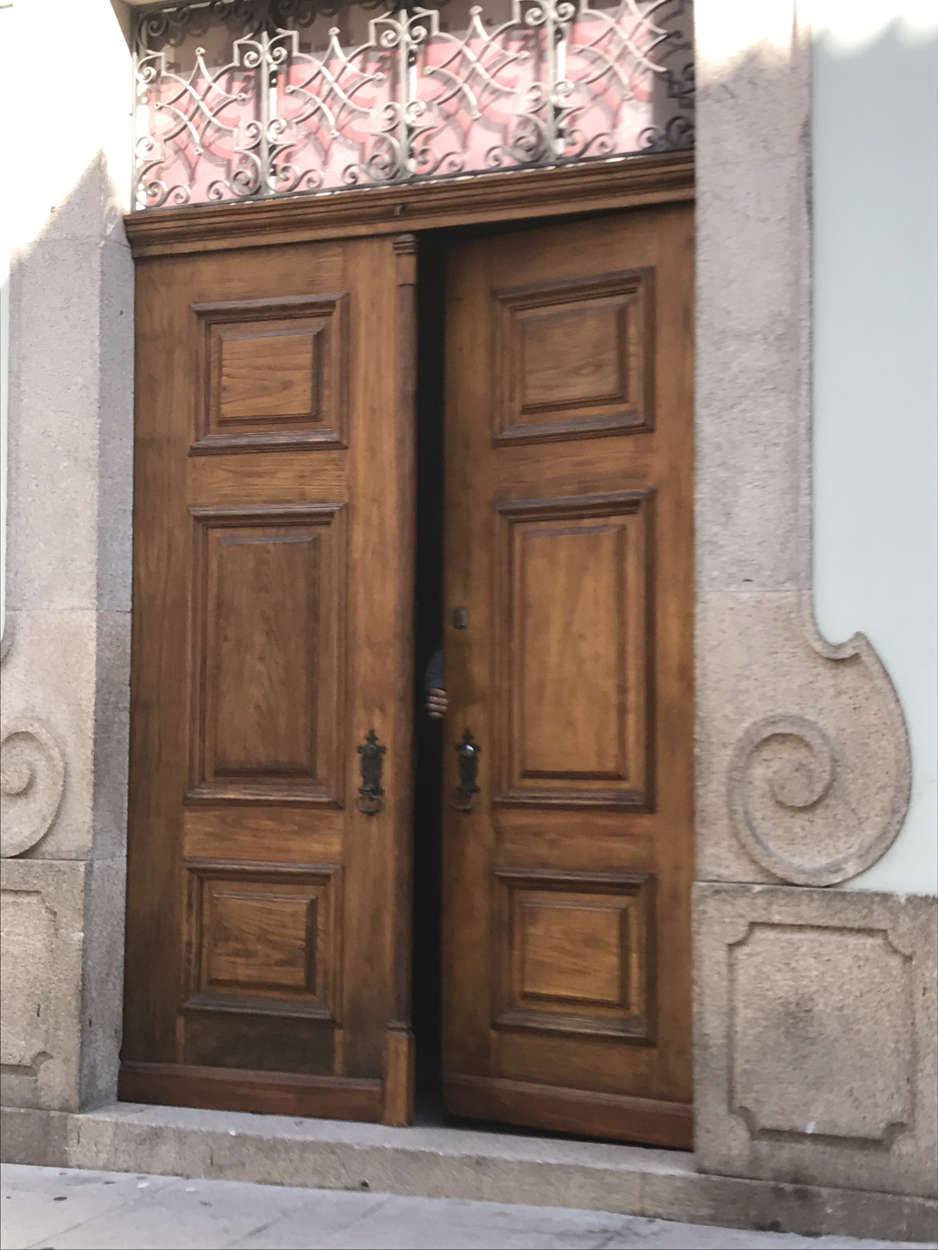
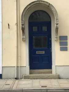
Here are some of the doors I saw this summer on our trip to Europe.

Porto Portugal

img_0523-1

Beaumaris, Wales

Merrion Square, Dublin

img_1178
img_1177
img_1179
img_1176

Nantes, France

img_0729
img_0734
img_0724

Saint-Estephe, France

img_0765
img_0771
img_0848-1

Saint-Emilion, France

img_0851
img_0873

Liborne, France

img_0877
img_0875
img_0891

San Sebastian, Spain (Basque)

img_0955
img_0967-2

Saint-Jean-de-Luz, France (Basque)

img_0971-1
img_0972
img_0973-2
img_0974-2
img_0975-2

Bilboa Spain

img_0999-1
img_0993-2
img_1072

I leave you with an open door.

Fall 2017…SEEING RED

Here we are at September 1, 2017. Definitely time to start thinking about Fall colors.

For Fall here are the Pantone colors:

17-1558 Grenadine-It is a powerful red. It is a warm red that to my eye has a coral-orange base rather than a Christmas red. Very attractive color that will be great on a variety of skin tones.  Think about the color of the syrup used for some cocktails like a Singapore Sling or a Pink Lady.

19-1725 Tawny Port- sticking with the alcohol references, think about a glass of Port wine.  This is a rich and sophisticated color in the deep red family.

13-2808 Ballet Slipper– this is a very soft pink “descended from the red family” but so soft. This was our go-to pink when I was buying or merchandising lingerie and sleepwear. It is very flattering and gives the wearer a rosy glow.

16-1341 Butterum– a warm tan shade. Think of a perfectly toasted slice of bread, or , if you want to stay with the alcohol references, think of a glass of Butterum!

19-4029 Navy Peony– This shade of navy is a perfect anchoring color. Some say it takes some of the load off of black as everyone’s go-to color. Navy is actually more flattering to most complexions than black is. But, seriously, would anyone ever surrender black in their wardrobe?

17-4402 Neutral Gray– Pantone refers to this as “the standard bearer of all neutrals.” This color also anchors the palette and can either be an accent or a total monochromatic outfit.

19-4524 Shaded Spruce- This is a beautiful deep shade of green with a lot of blue in it. Think of the Blue Spruce trees that some people choose for their Christmas tree.

16-0543 Golden Lime– Very earthy shade with golden undertones. This is a nice complement to the fall palette.

17-4041 Marina- This is a beautiful shade of blue. It is the only cool color in the palette and it is fresh and bright.

17-1145 Autumn Maple– THE autumnal color. This is a warm color and is a combination of rusts. Think falling leaves.

A new color has been created by Pantone and the Prince Estate. It will be called “Love Symbol #2″. It is a distinctive blue base purple developed to honor Prince. This will insure that there will be consistency with the color and will safeguard his legacy forever.


Fashion Observation

We just got back from an 18 day vacation in Europe. I will be blogging about all of our stops and experiences but first I had to share a fashion observation.

The summer months are not the time to see what is happening in fashion in Europe.  Everyone is on vacation too and in most places it is very warm. But I have to share the summer of 2017 phenomenon…BLACK AND WHITE STRIPES.

On the cruise ship we were on the top four countries represented were USA, Australia, Germany, and Great Britain. Every time I turned around someone was wearing black and white stripes. I shared my observation with my friend Rose and once I said it out loud it was as if people were only wearing black and white stripes!  You would see them around the same table dining in their black and white stripes. You would see a couple at another table where the man and the woman were wearing black and white stripes. There were tops, shirts, dresses and pants in stripes. Vertical and horizontal and diagonal versions were all on display.  We wished we had kept a list on how many people we saw because it was phenomenal.

At least it was a statement that looks good on everyone and is classic and fresh no matter what the year.

By the way, this writer traveled from JFK to Lisbon in a black and white stripe dress.


Fashion Observation

We just got back from an 18 day vacation in Europe. I will be blogging about all of our stops and experiences but first I had to share a fashion observation.

The summer months are not the time to see what is happening in fashion in Europe.  Everyone is on vacation too and in most places it is very warm. But I have to share the summer of 2017 phenomenon…BLACK AND WHITE STRIPES.

On the cruise ship we were on the top four countries represented were USA, Australia, Germany, and Great Britain. Every time I turned around someone was wearing black and white stripes. I shared my observation with my friend Rose and once I said it out loud it was as if people were only wearing black and white stripes!  You would see them around the same table dining in their black and white stripes. You would see a couple at another table where the man and the woman were wearing black and white stripes. There were tops, shirts, dresses and pants in stripes. Vertical and horizontal and diagonal versions were all on display.  We wished we had kept a list on how many people we saw because it was phenomenal.

At least it was a statement that looks good on everyone and is classic and fresh no matter what the year.

By the way, this writer traveled from JFK to Lisbon in a black and white stripe dress.


A Man With A Passion

Last year I saw an article ranking various restaurants in Bergen County for “best” this and that and I made a list of places I wanted to go to. At the top of the list was Ivy Inn at 288 Terrace Ave in Hasbrouck Heights, NJ. This restaurant was a former stagecoach inn with a fireplace, brick walls and, the selling point for us, live piano.

Our first visit there was for Happy Hour on a Thursday. We went and sat at this cozy bar and met our bartender Amelia. She was welcoming and we immediately felt that we had found a great new spot! Ivy Inn had been voted Most Romantic bar and restaurant, best bar for happy hour and maybe more “bests”.  We ordered wine and some items from the bar menu which is fantastic, extensive and incredibly well priced. But, the best was yet to come! Live piano music from 4:30 until closing on Thursday, Friday and Saturday.

Meeting Jerry Mendelson was the equivalent of meeting the Ambassador for the Ivy Inn. Jerry has been Ivy Inn’s piano man for the last 17 years.  Jerry is 95 years young.  He started playing the piano when he was 8. College was interrupted when Pearl Harbor was attacked and he joined the Navy. He served on an aircraft carrier. He was shot down but was picked up and saved by the Philippine underground who took care of them and got them back to the ship. Jerry has been interviewed for a Library of Congress article. When his civilian life resumed, he went to Columbia and was accepted at Julliard. He has played for or with Les Paul, Ray Charles, and Tony Bennett and many more.  His was the music that filled Radio City Music Hall and he filled in for the organ player at Yankee Stadium.

Jerry can play any and every song you could possibly want to hear. Asked why at 95 he is still working? I love what I do, he says. He loves playing songs that his guests want to hear. And he adds, “it has been a career with no regrets”.

Such passion! I feel so blessed to have met this man. We have enjoyed many “happy hours” listening to him play.

WONDER WOMAN

Although Wonder Woman was born in 1941, she is now on the BIG screen letting you know that even at her age she can still kick butt!

CBS  Sunday morning recently did a segment on Wonder Woman to coincide with the movie opening.  In 1941 DC Comics publisher Max Gaines was concerned that comics were too violent and he turned to William Marston for his input.  Marston was a psychologist and author.  Marston suggested they needed a female superhero. “She’ll be essentially a pacifist. She’ll fight for democracy, but she will be fighting for equal rights for women. And her super powers will be love and truth and beauty.”

Marston was very much influenced by the suffragist movement from his days at Harvard in the early 1900’s.  In the early comics Wonder Woman was frequently breaking out of chains.  Marston said “She’s gotta be chained up so that she can break herself free”. Harvard professor Jill Lepore (author of The Secret History of Wonder Woman) said “No one ever rescues her; she rescues herself.”

As a fashion aficionado, I was interested in how they would costume our superhero Diana in the new movie. Since it is an origin story she was clad in Amazonian fashions from the times of the island of Themyscira. Over the last 76 years Wonder Woman has been in various forms of dress that reflected the times. There was a big debate about whether or not the original Wonder Woman was wearing a skirt. Actually it was culottes (I TOLD you styles recycle).  How could they risk a skirt flying up over her head when she was doing battle?

And then there is the Lasso of Truth. Wouldn’t it be something to have one of these lariats?  Anyone it captures is compelled to tell the truth. WOW.

All in all, the movie is a fun action packed story and I look forward to sequels.

What I would really love to see is someone, female or male, show up with wrist cuffs that can deflect all of the negativity flying around today.  And as Diana Princess of Themyscira says, Only Love Can Save The World. What a concept.